A few weeks before, after receiving an email invitation from Marina Bay Sands, my friend invited me in turn for a typesetting workshop at the Art Science Museum. Anything that has the word ‘Type’ in it I couldn’t say no to. So this is how it went.
The 1-hour hands on workshop was a quick introduction to the world of typsetting, conducted by Typesettingsg. The ‘lecture’ part of the workshop was about 20 minutes, and the rest was just us fumbling with tools to form our names for personal namecards, then queueing up to ink 5 cards.
Not the most productive hour, but great fun nonetheless.
First, some interesting facts: Printing was actually invented by the Chinese back in the Tang dynasty, due to the invention and production of paper. The first form of printing was woodblocks, which meant that everything they wanted to print actually had to be carved out from blocks of wood.

It wasn’t until about a thousand years later when Johannes Gutenberg improved on the method, by using metal to create movable type. It helped that the western alphabet had a limited number of characters to make movable type more versatile. Gutenberg then brought the method back to the west and spread it using the most read text in the world – the Bible. “Gutenberg Bible, Lenox Copy, New York Public Library, 2009. Pic 01” by NYC Wanderer (Kevin Eng)
As you can see, typesetting is not that complicated, which in turn makes it an art form really beautiful.
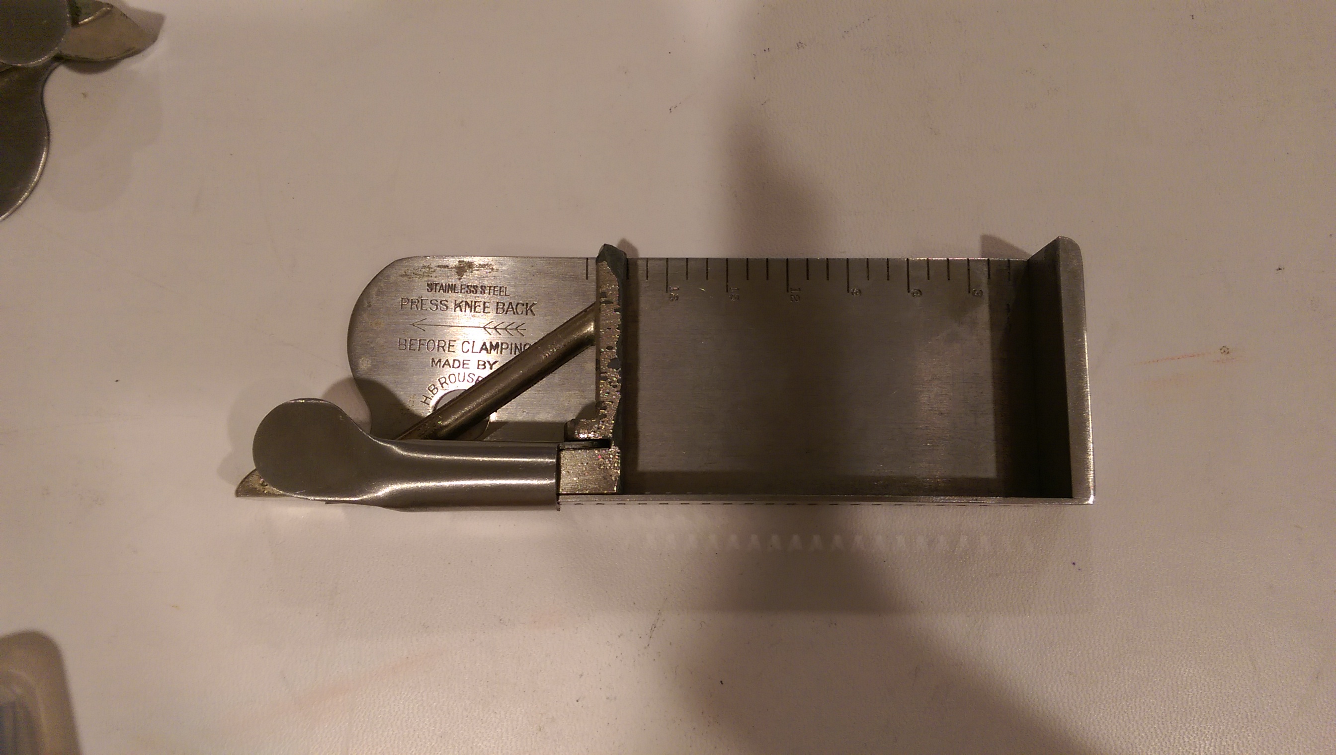
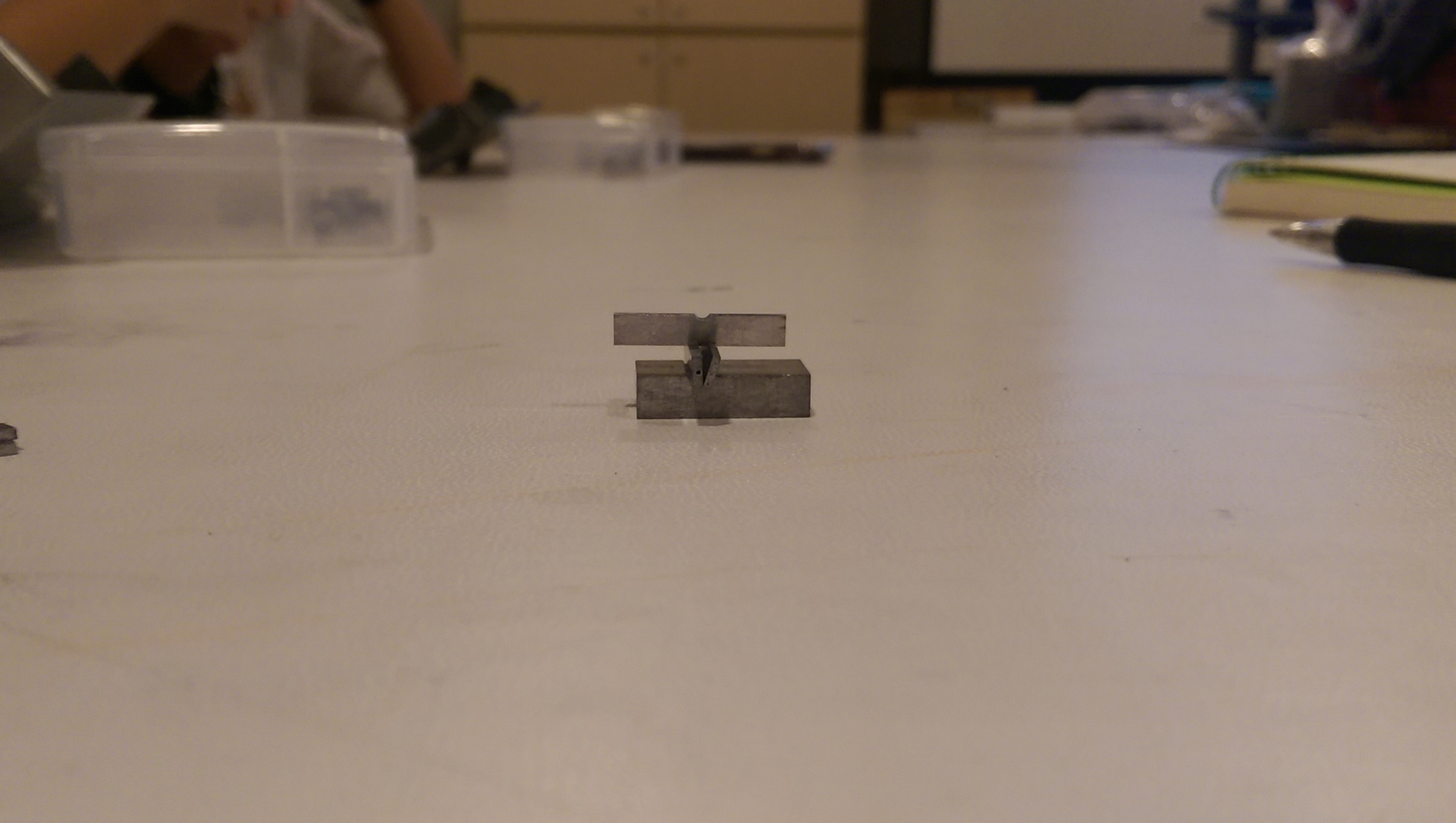
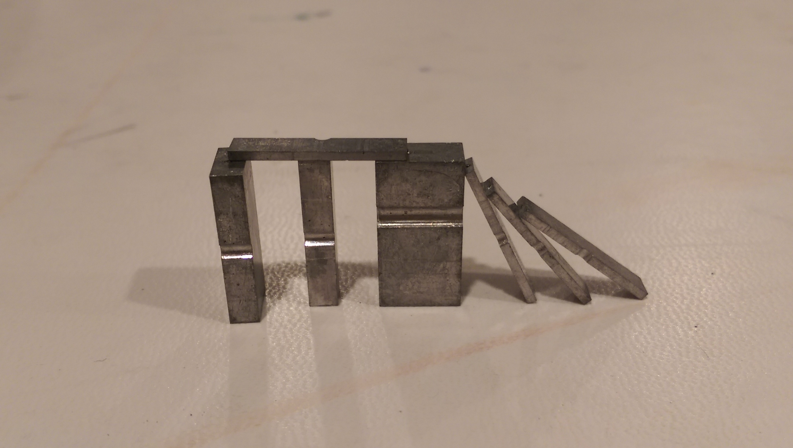
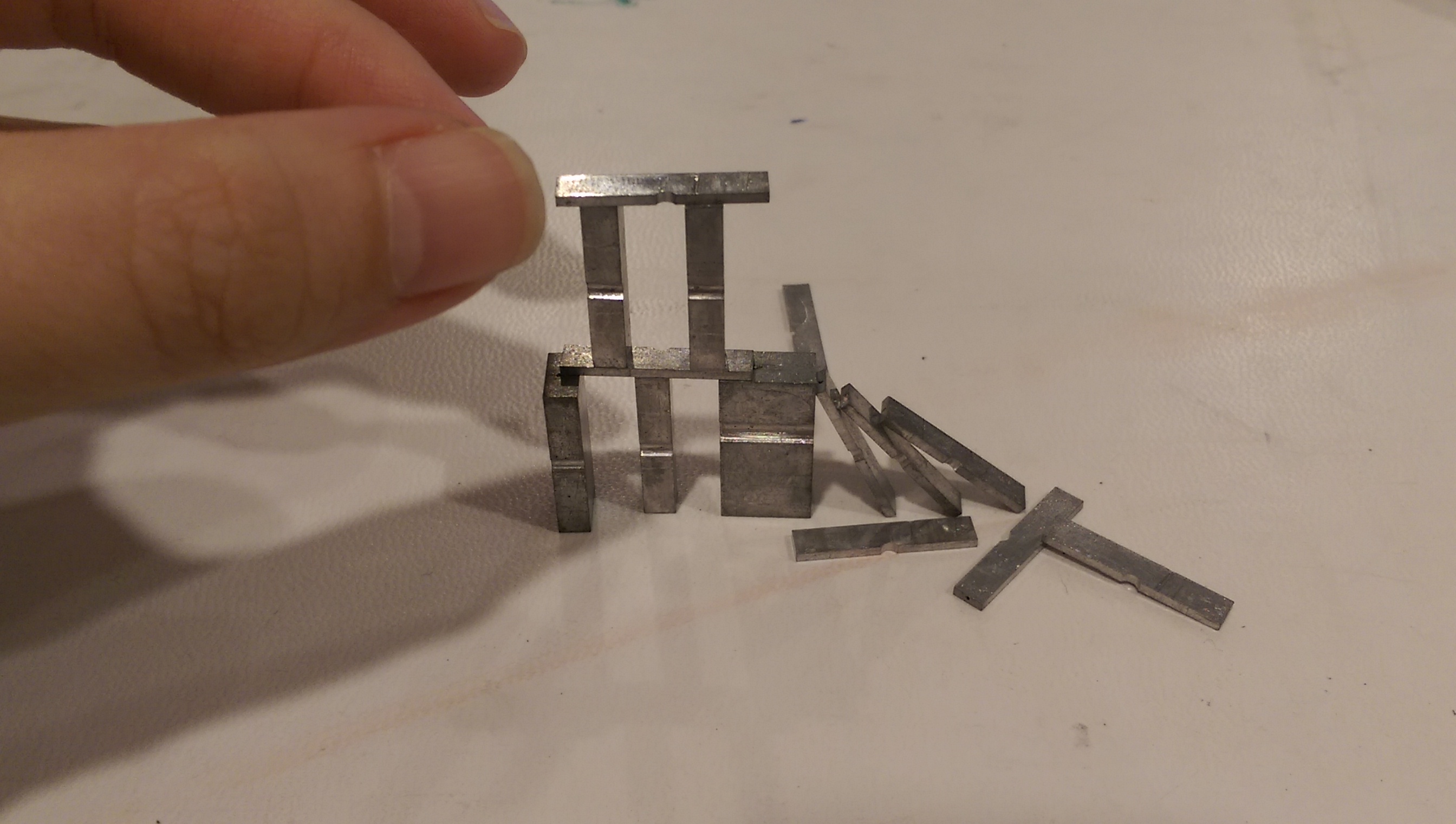
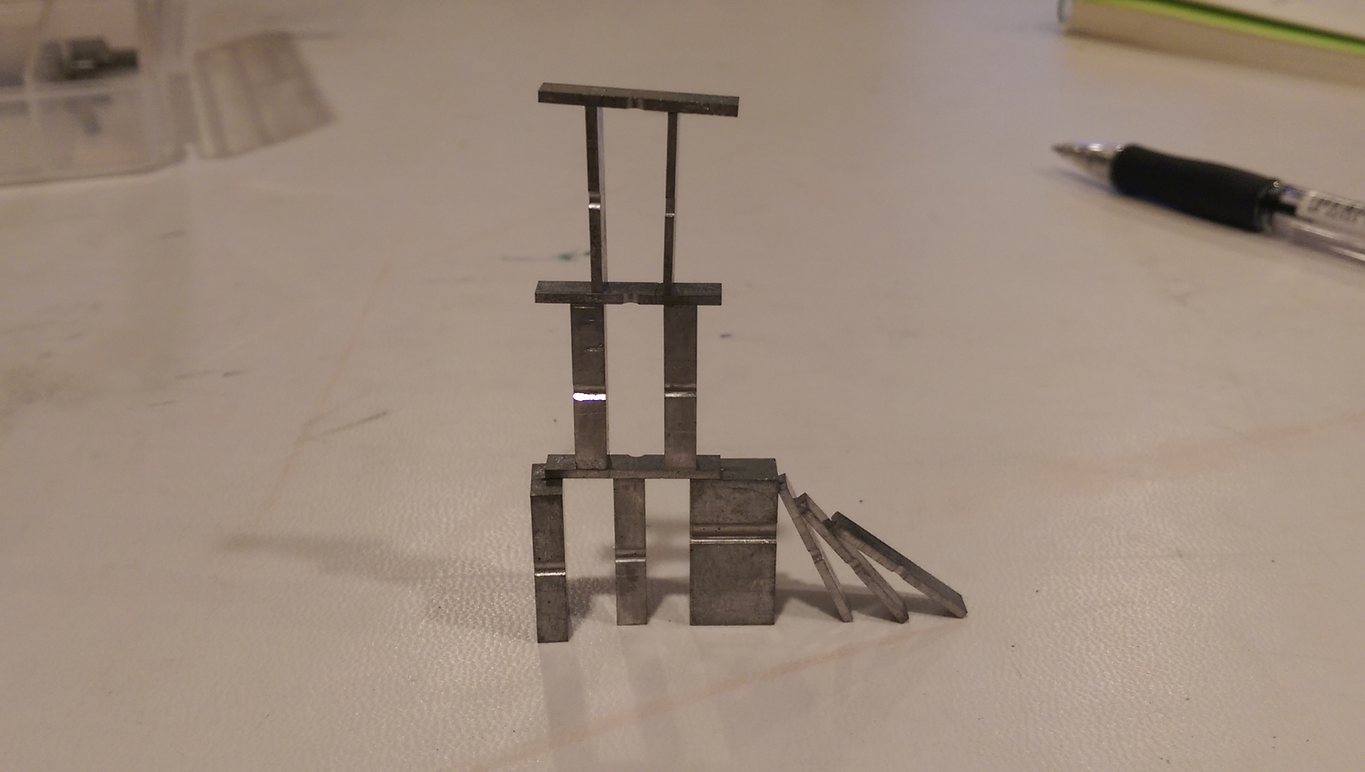
The typesetting stick is a clamp where you place the letters, spacers and quads to form the words to be printed. It’s to be held in your left hand while your right hand handles the itsy-bitsy pieces of letters. If you’re a left-hander, too bad. (Not my words)
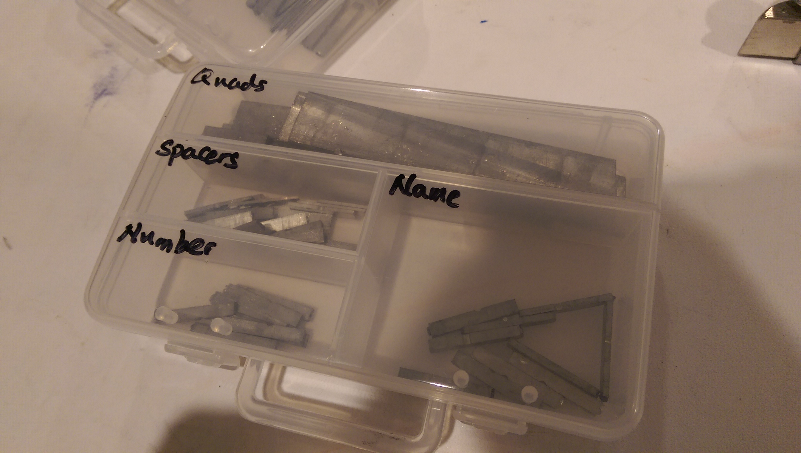
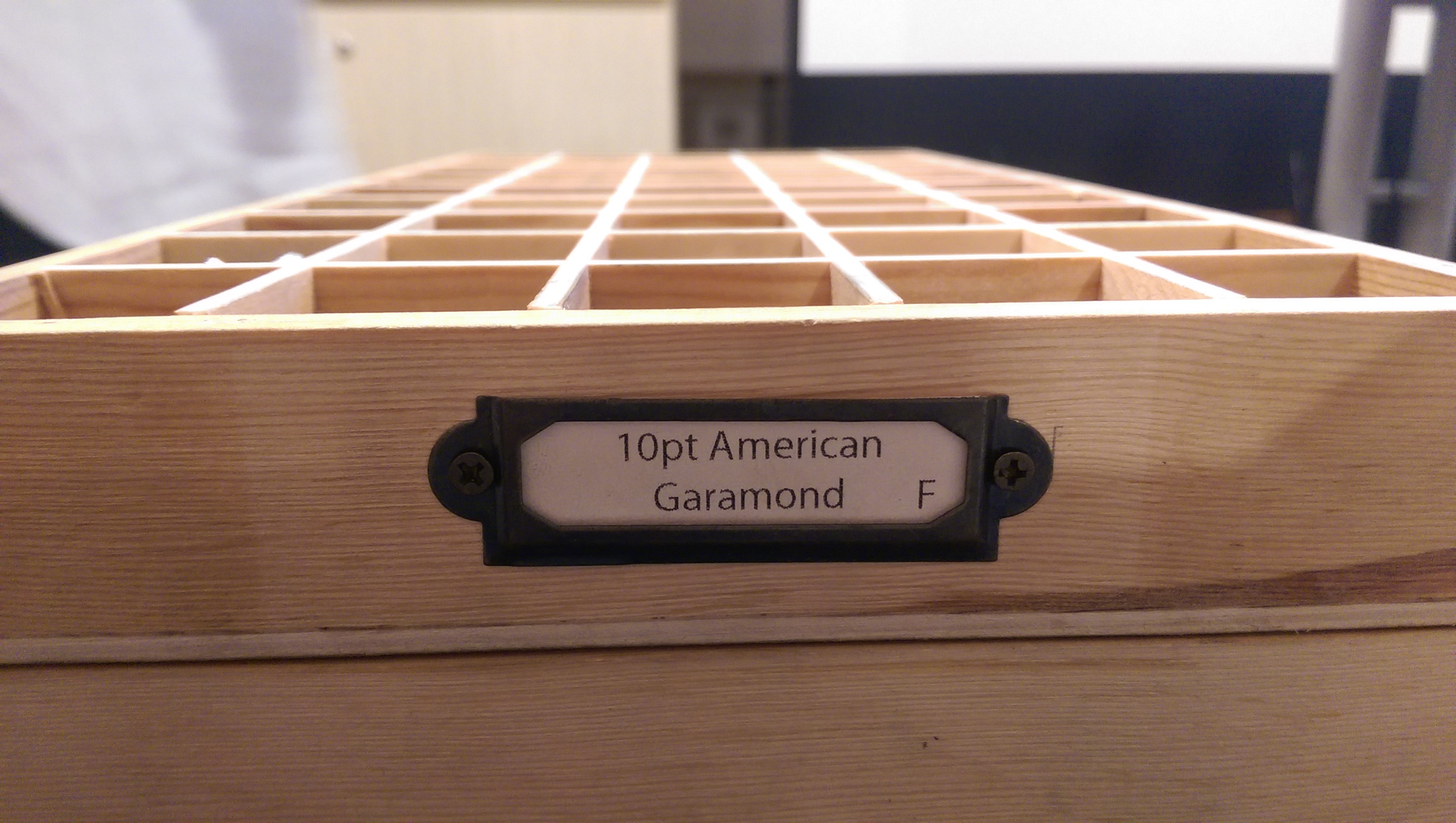
We had a few different types of pieces we started off with. ‘Name’ contained the letters which made up our name, and ‘Number’ is pretty self-explanatory. In this workshop, we used a 10pt Garamond font.

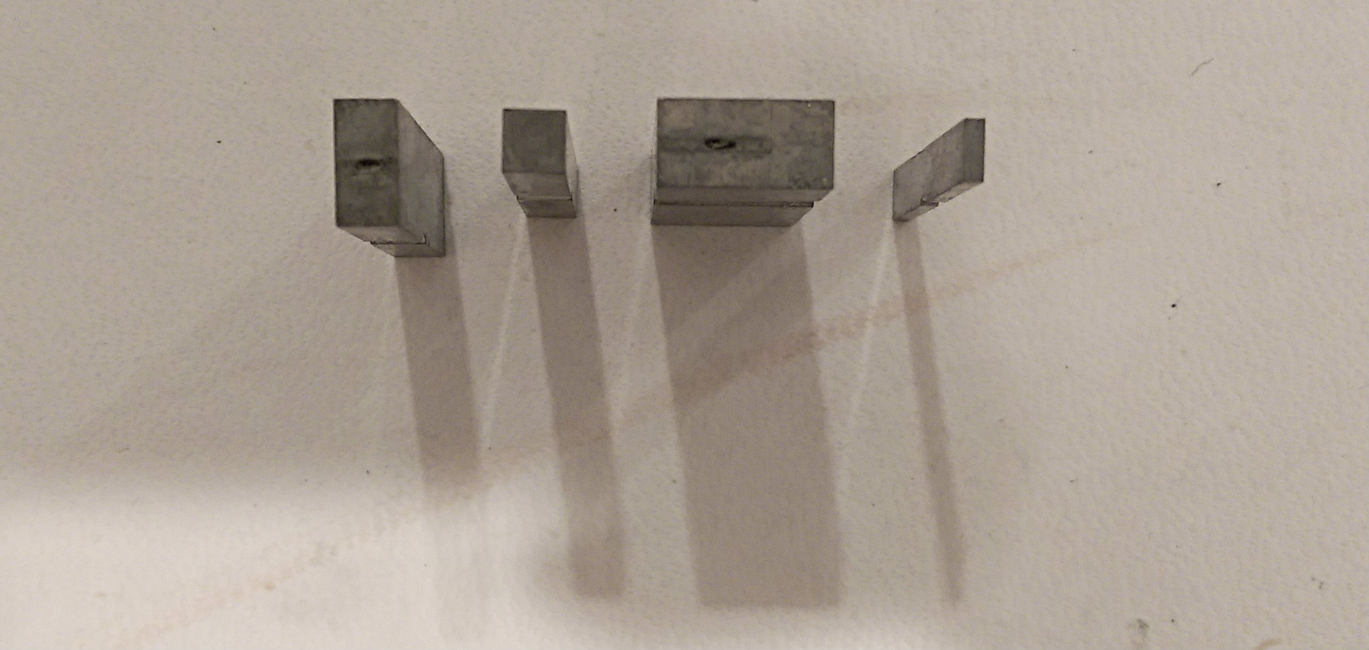
‘Quads’ are long spaces to separate lines, similar to an ‘Enter’ on our keyboards. ‘Spacers’ as just that – spacers which you can put between words, equivalent to a spacebar or ‘tab’ on our keyboards. There are different types of spacers below to form the exact spaces between letters or words you would require.
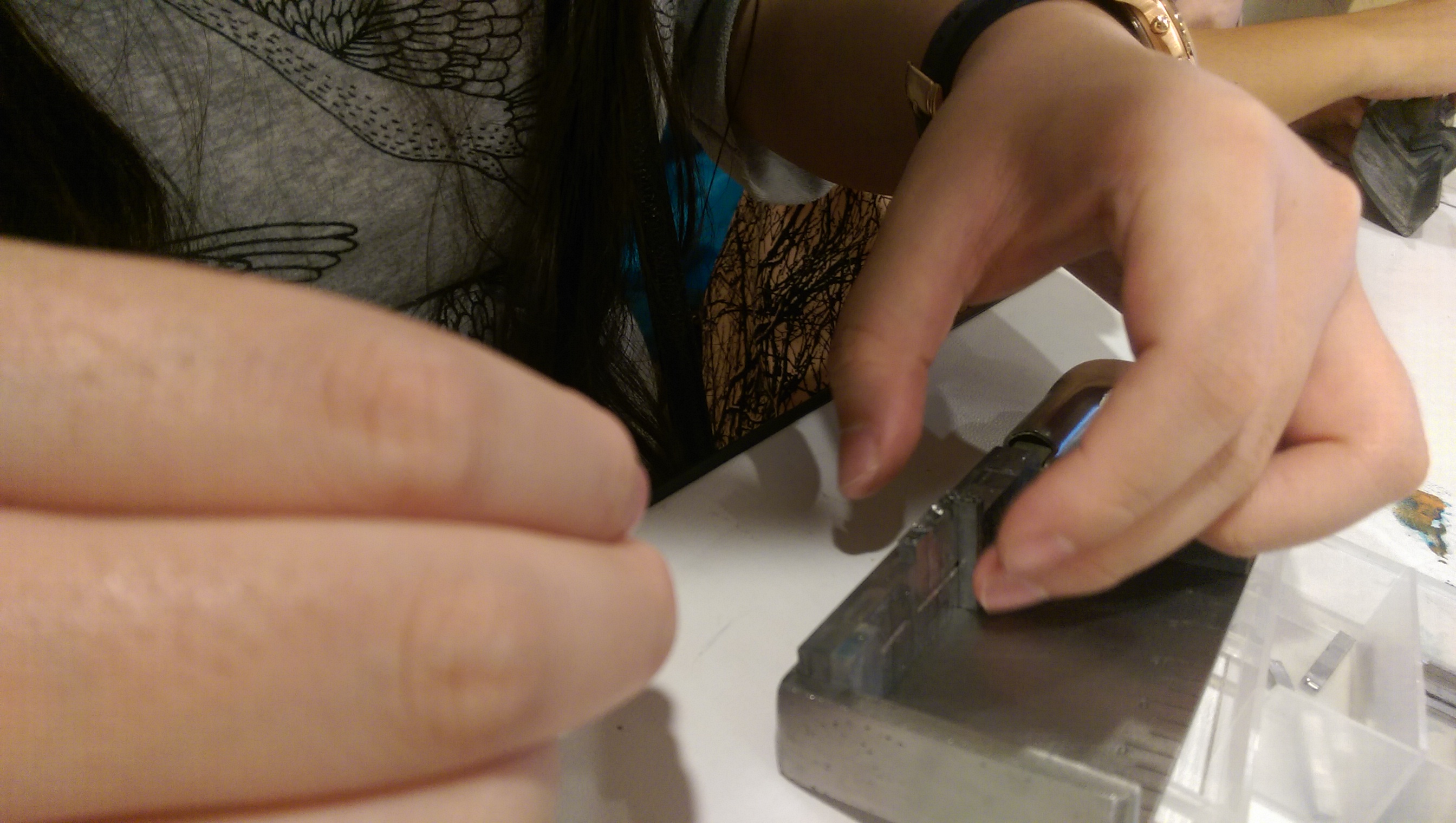
Now it’s time for us to fumble for a few long minutes to form our names and numbers on the composing stick. Thick thumbs, anyone?


Then we had to wait in queue to use the press….
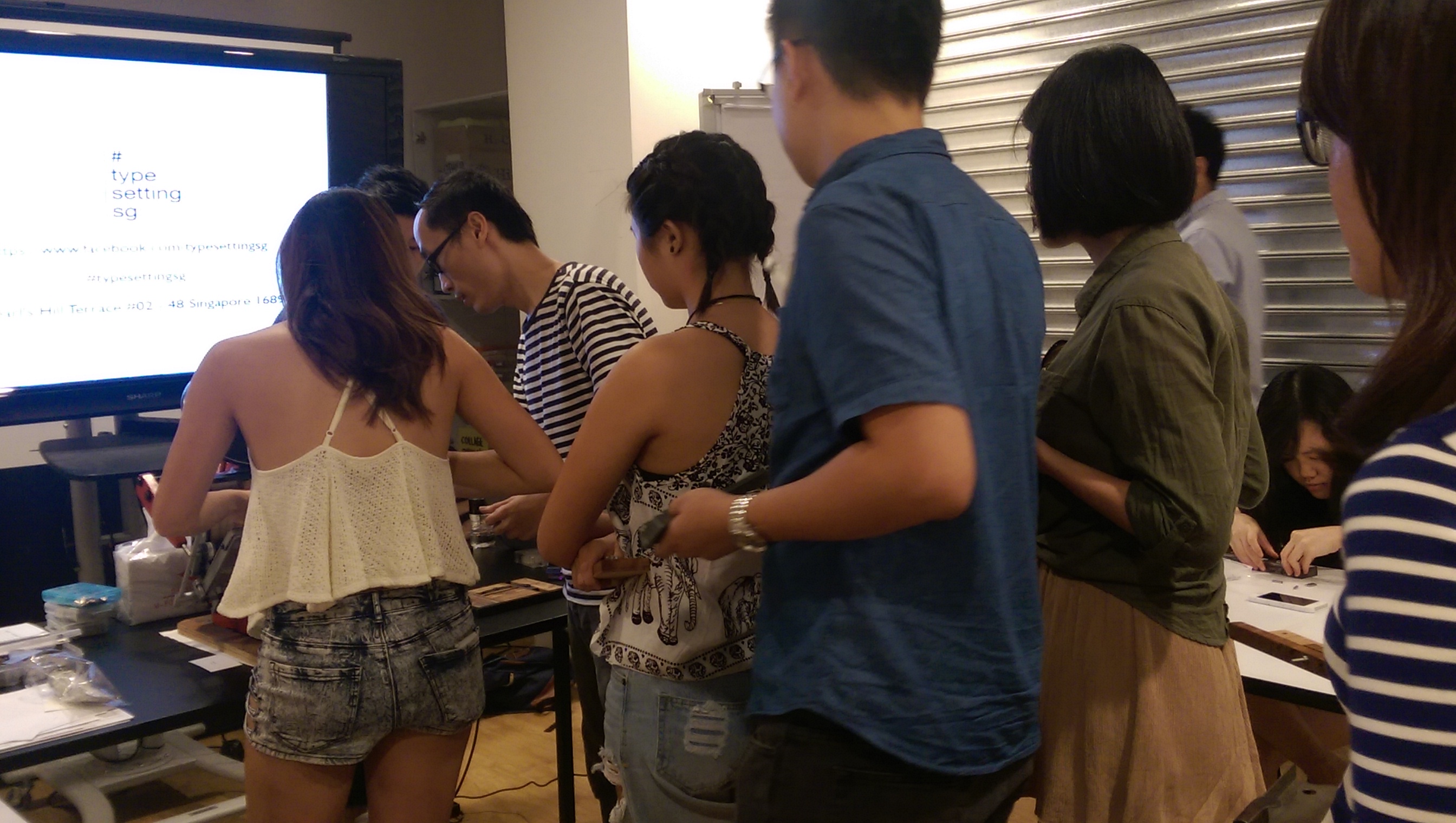
And I got bored…..
Still waiting….
And it was our turn!
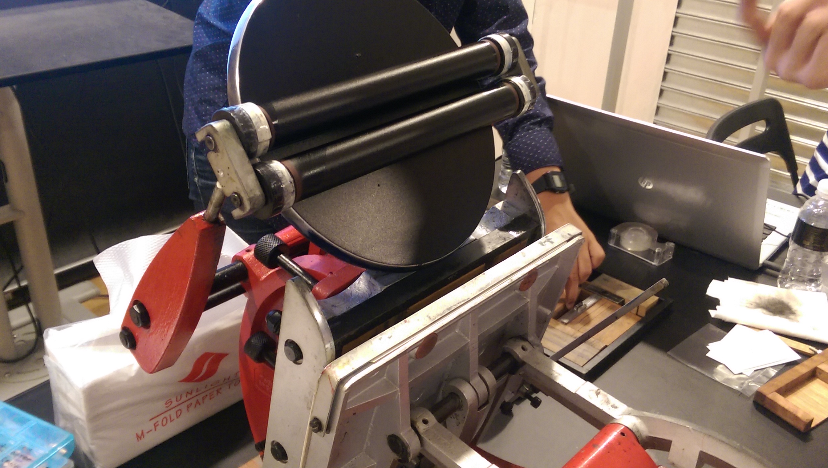
Our instructor, Yao Yu, was a flurry of twisting hands and fingers as he removed our type from the composing stick, tying up our type and loading it onto the press.

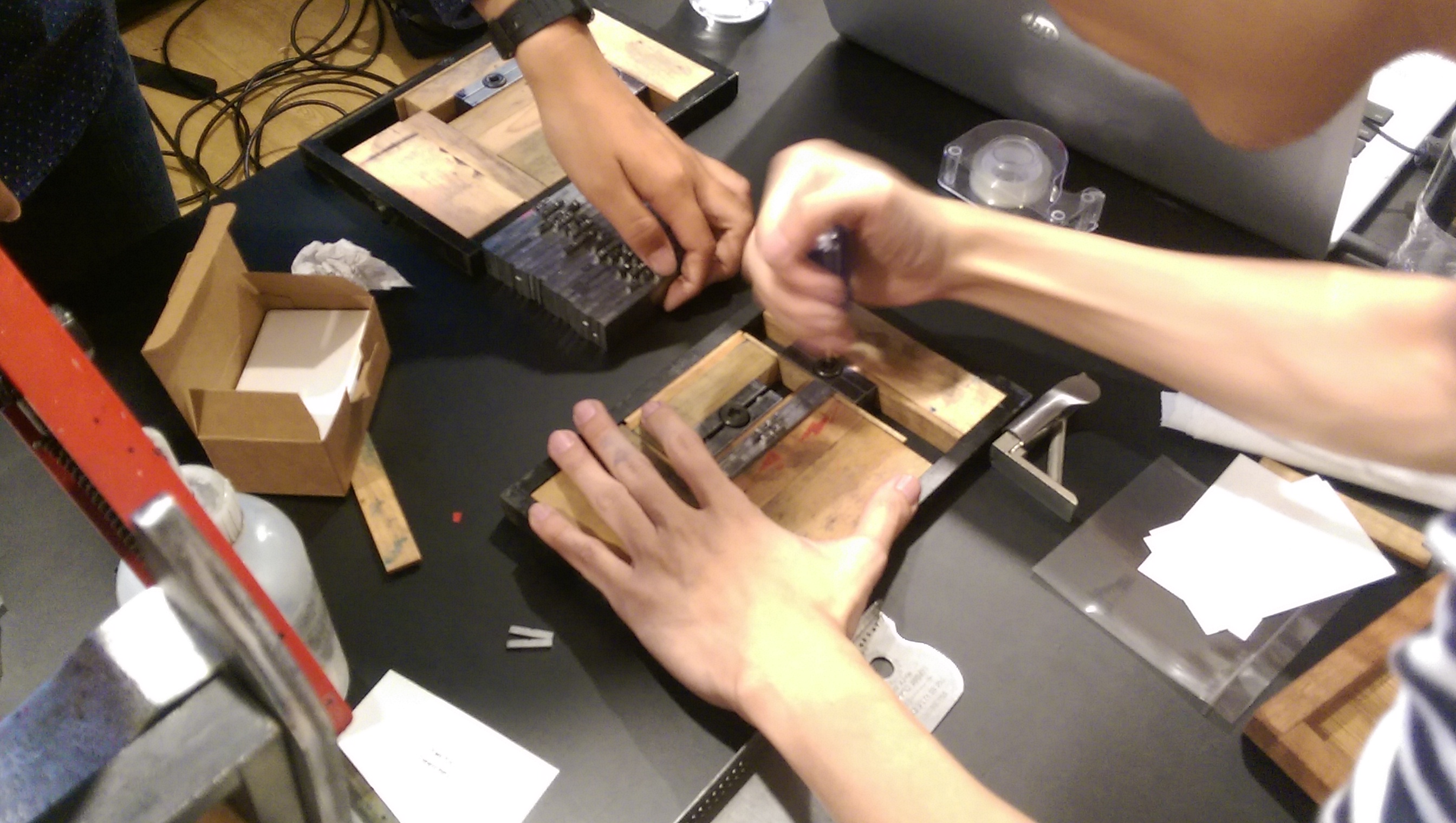
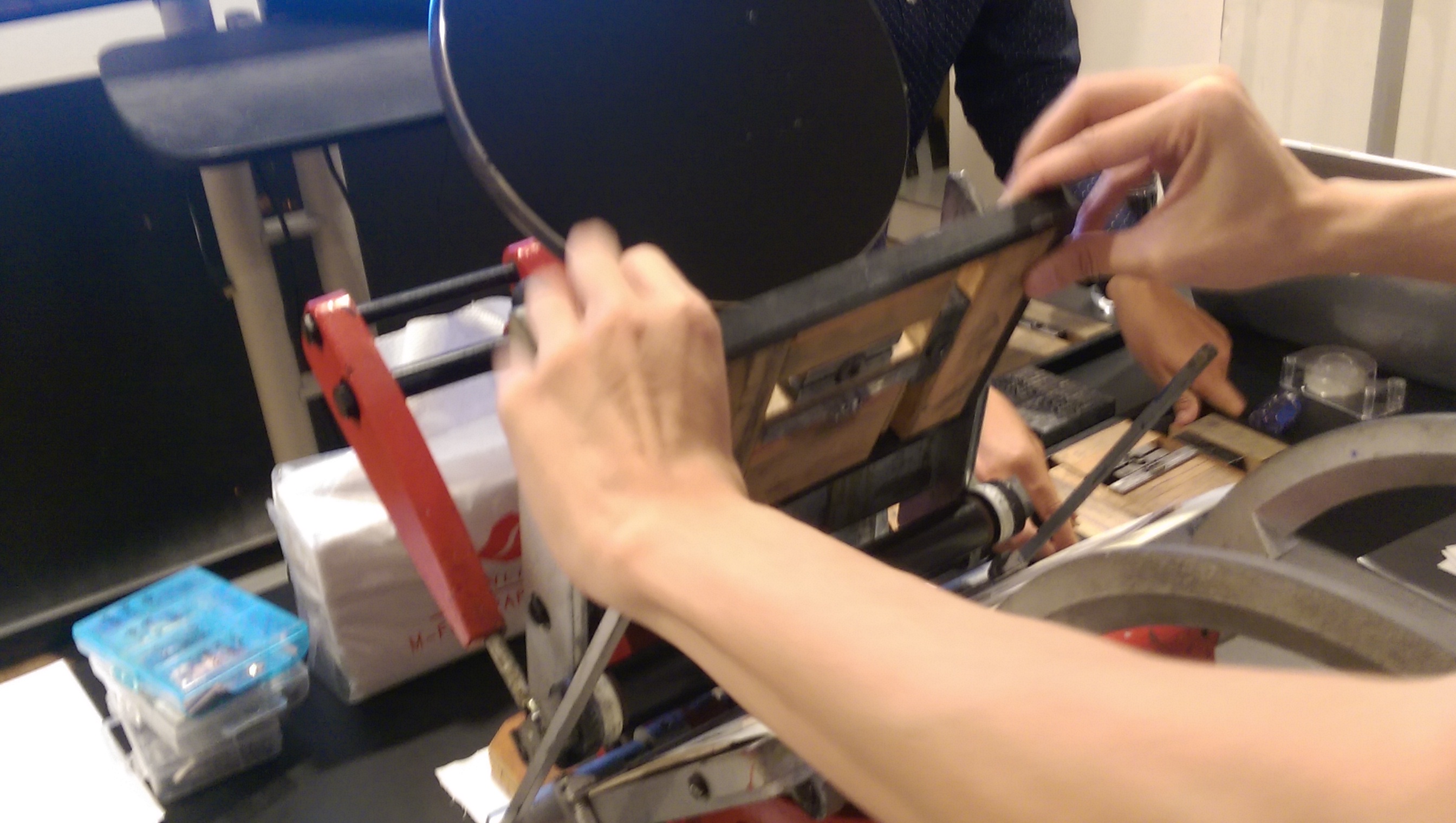
The pad of the press already held the ink. After putting in our blank namecard, we had to do a half-press to ink our type, then press down fully to literally press the words onto the paper.
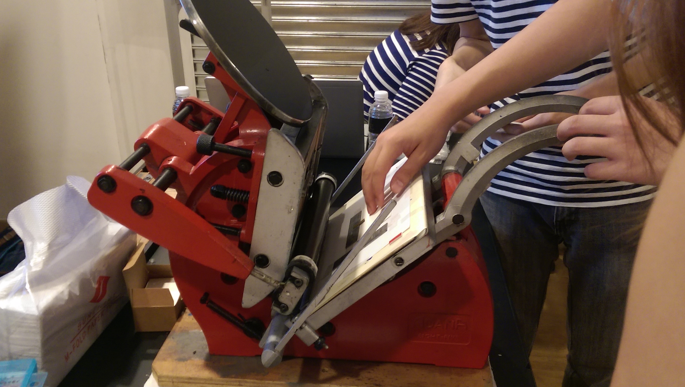
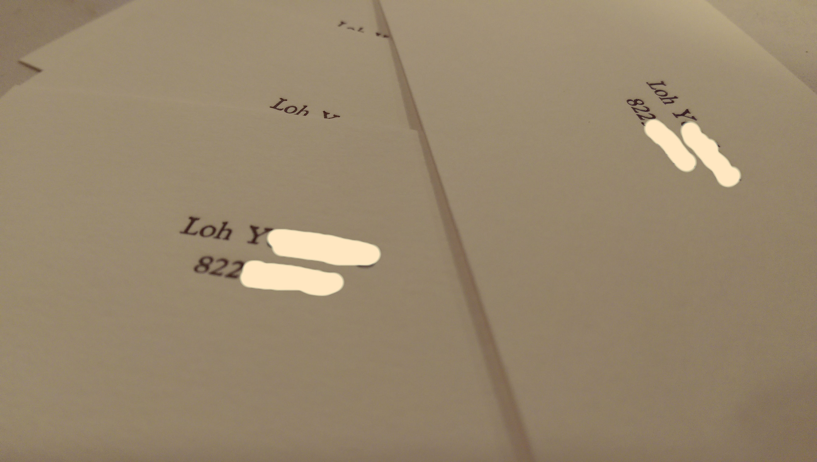
And, would you look at that. Letter-pressed namecards.
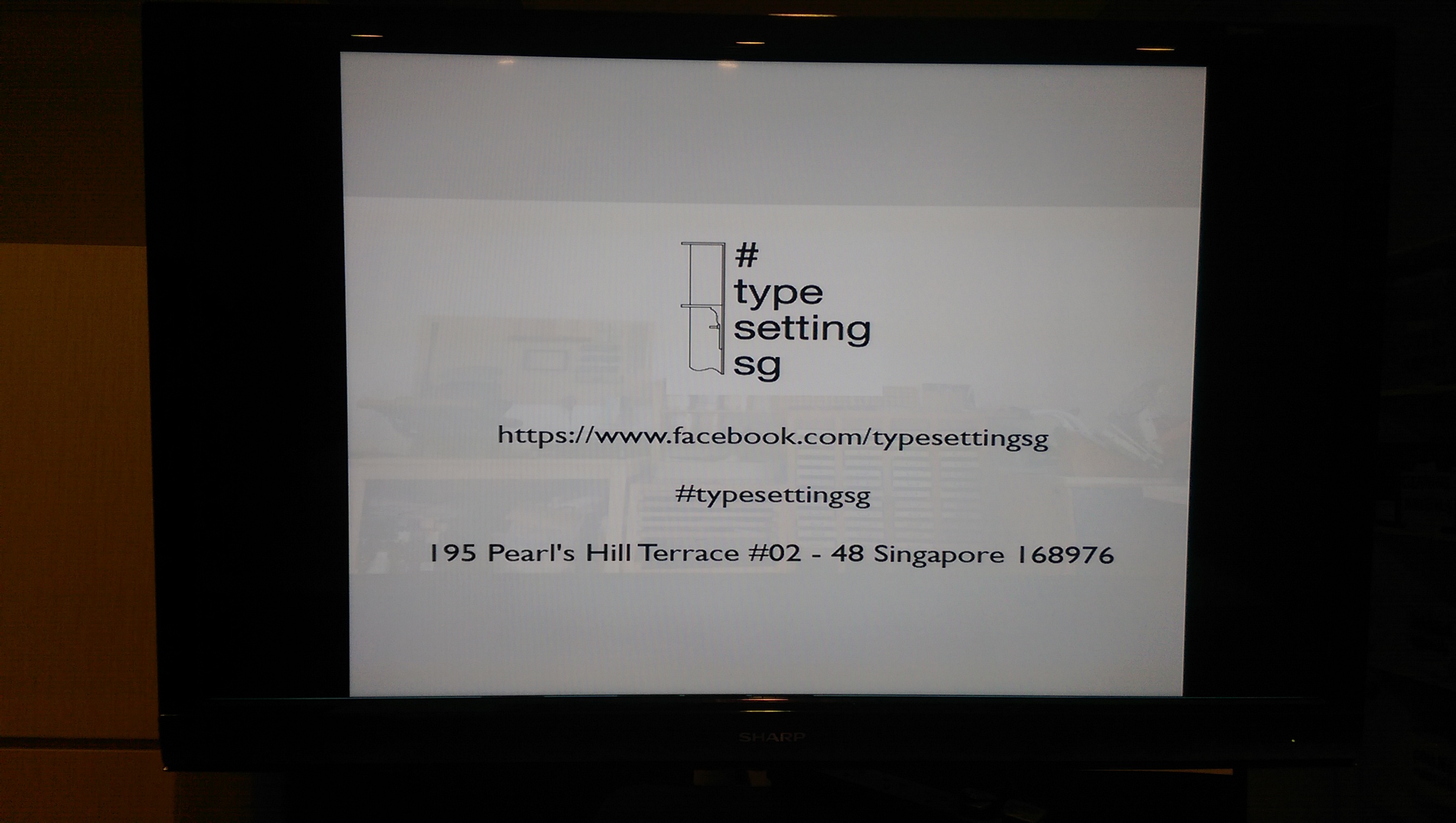
If you’d like to try your hand at letterpressing as well, contact Typesettingsg for their workshop schedule, or catch them at public workshops, like the one above!